Govern: Digitizing Democracy
Designing an app for U.S. citizens to de-mystify Congress and hold elected officials accountable.
PROJECT TYPE
Freelance
THE TEAM
John McNicholas (Product Manager)
& myself!
MY ROLE
User Research
Wireframing
Brand Design
Prototyping
Usability Testing
TOOLS
Figma
DURATION
4 Months (2023)
OVERVIEW
How can we be sure what the will of the people truly is?
Ideally, in a democracy, elected officials should vote on legislation in the same way their communities would vote. But with the lobbying efforts of political parties corrupting legislative decisions with billions of dollars, it's difficult to trust that our representatives will vote the way we want and expect.
John McNicholas noticed this issue in his home country of Ireland and in the U.S., and he had been thinking about building a digital solution for years. He reached out to me for design help and I happily took the challenge.
Here is the full problem I uncovered through user research, and the way I solved it.
THE PROBLEM
Bill descriptions are too dense and complex for people to keep track of Congressional decisions. Keeping track of elected representatives is challenging, and popular news outlets are often biased.
THE SOLUTION
I designed a mobile application with a skimmable feed of legislation currently under debate in Congress. Users can keep tabs on their representatives to see how their votes compare to the community's.
BACKGROUND
Before diving into interviews, I researched the problem space a bit more.
Across both political parties, Americans say their biggest issue with government is the sense of corruption among elected officials. As I read up on the public's perception of American government, it became clear that people are cynical of their democracy's integrity.
According to the Pew Research Center:
- 55% say that ordinary Americans would be more competent at solving national problems than elected representatives.
- 76% say that campaign spending plays a greater role in politics than ever before.
- 74% believe that politicians don't care what the general population thinks when making decisions.
Competitive Analysis
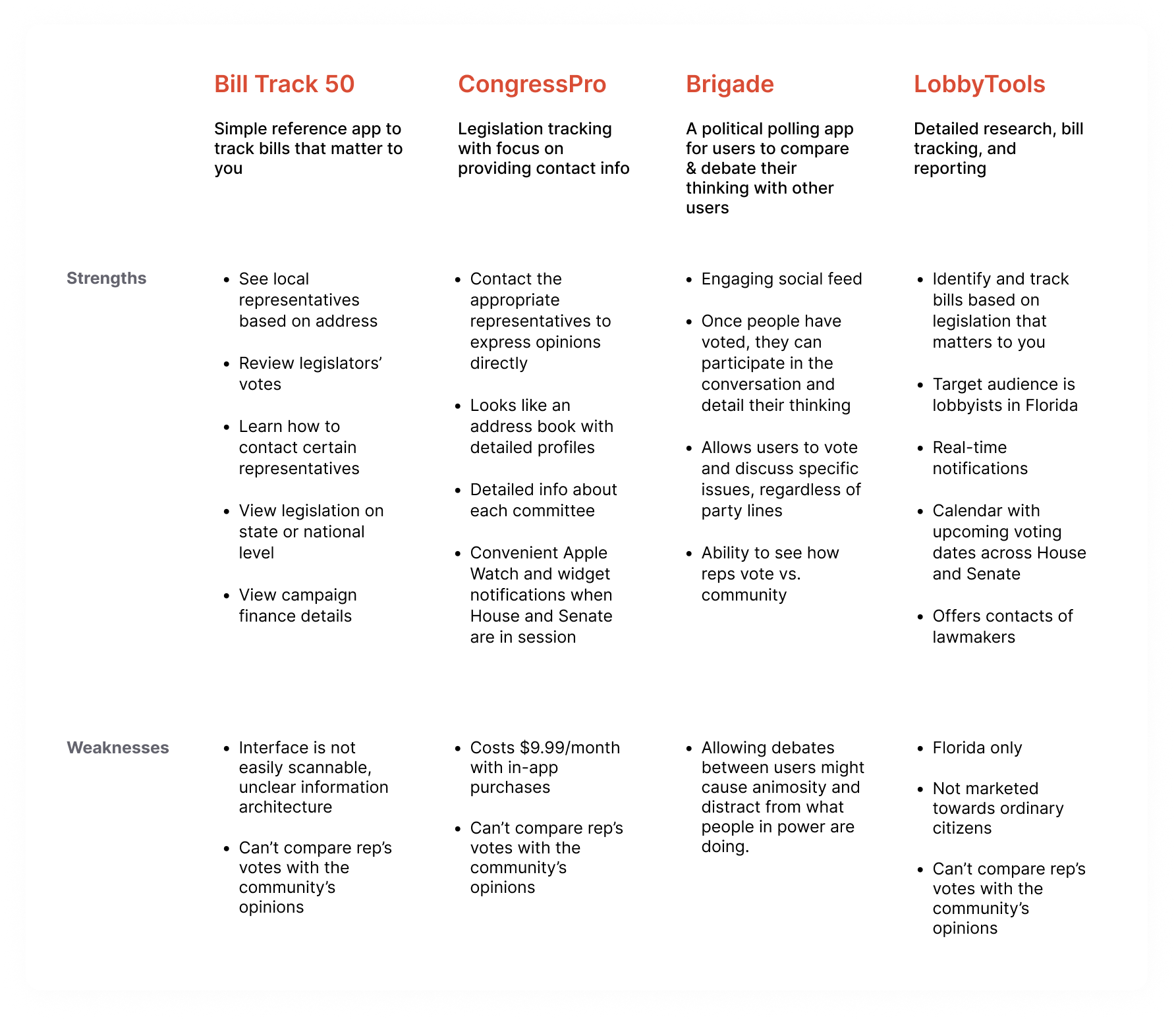
I took some time to research competitors that have attempted to solve this problem. I concluded that there aren't many user-friendly mobile tools out there for tracking legislation and politican activity in one place. Most of them are just informative bill-trackers.
My main finding was that none of these tools offered a way to express your opinion and compare your votes with others – except for Brigade, which no longer exists. Brigade was acquired by Countable in 2018, and although it was engaging, it allowed too much of a forum for debate that became a space for only the loudest voices in the room.
Beyond just an updated list of bills, I saw an opportunity to create a space where the user would be able to interact with the legislation and compare their thoughts with politicians, without being influenced by commentary from other users.
USER INTERVIEWS
I interviewed five U.S. voters to learn their sentiment about the state of democracy.
More specifically, I wanted to learn their needs, motivations, and frustrations with their current methods of staying informed. I spoke to digital natives (ages 18-40) who are U.S. citizens and self-identify as politically active. Click here for my interview guide.
Objectives for 1:1 Interviews
- Understand how people currently keep up with legislation
- Understand what motivates people to stay informed, and how motivated they are to do so
- Find out what frustrates people most about politicians and the legislative process
- Discover what people feel when they think about voting in an election
- Understand people's perceived level of individual impact on the political process
FINDINGS & ANALYSIS
Overall, people feel that staying properly informed on the goings-on of Congress would be a full time job.
Affinity Map
With each major insight on a sticky note, I grouped the insights by similarity and topic. The following themes emerged:
- Political debates on social media are emotionally volatile, and people find them unpleasant. However, social media is the most convenient way to get political news without digging.
- All participants keep up with the news on traditional news sites, but most are cynical about the integrity and completeness of that news.
- All participants are cynical about the 2-party system, and don't believe it is representative of the people's interests.
- All participants believe our government and reporting are such that it is too difficult for the average citizen to stay informed on legislative activity.
A portion of the clusters that formed in my affinity map
"My knowledge of what Congress is doing is pretty nebulous. A lot goes on that we don't hear about because of the volume of what they do. But I wouldn't know where to begin to find those details."
– R.S., Participant
"If everyday citizens and community could be more involved, they’d be able to hold politicians accountable."
– L. W., Participant
Persona
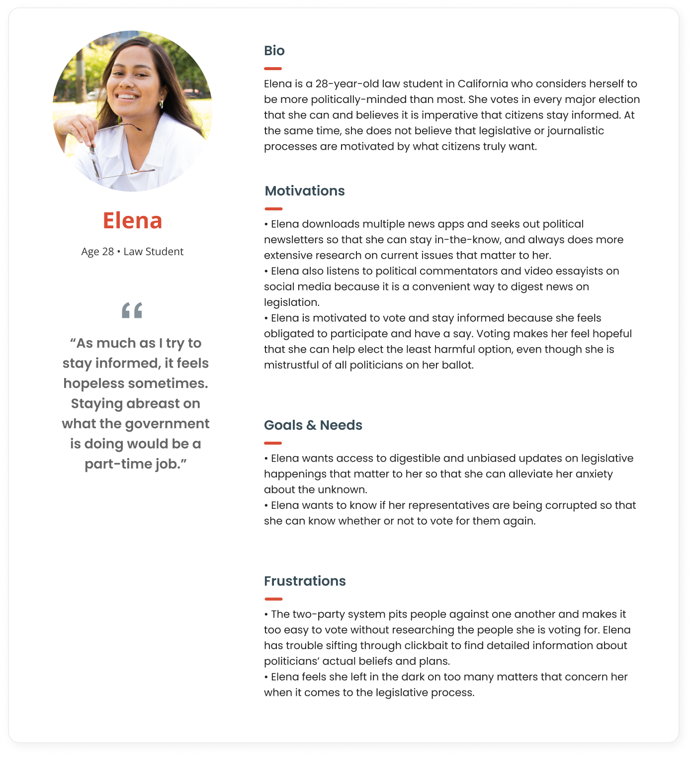
I summarized the most glaring motivations, goals, and frustrations into a single persona to present to the client.
Feature Roadmap
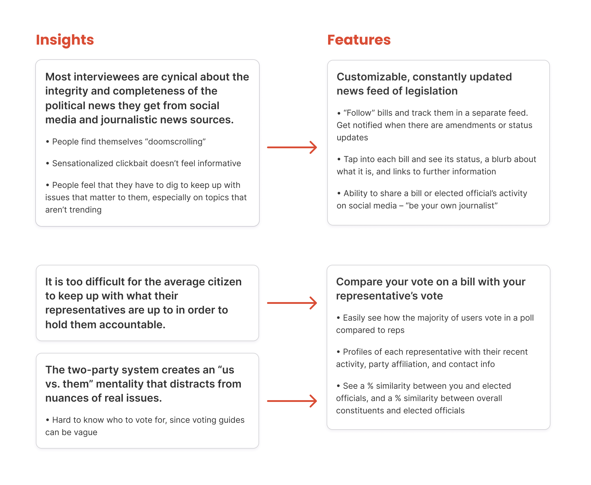
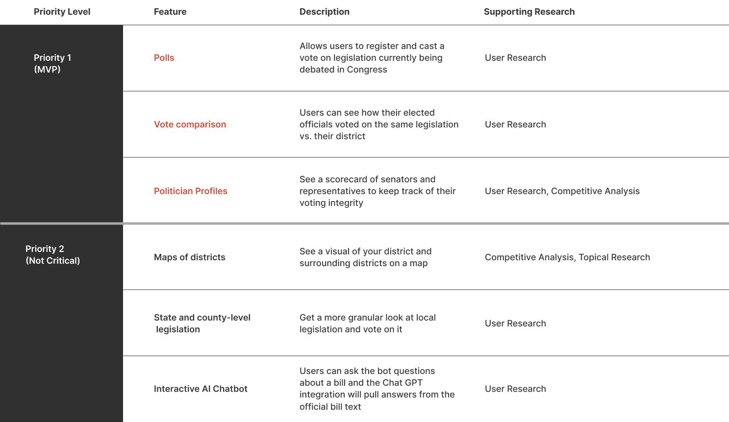
From the three major frustrations that most interviewees expressed, I outlined two main features that this MVP could have. My client and I decided to limit the scope to the federal level rather than getting into the nitty gritty of state legislatures for this iteration.
IDEATION & DESIGN
Time for the challenge – finding a way to make the inaccessible world of U.S. legislation approachable on a mobile device.
Site Map
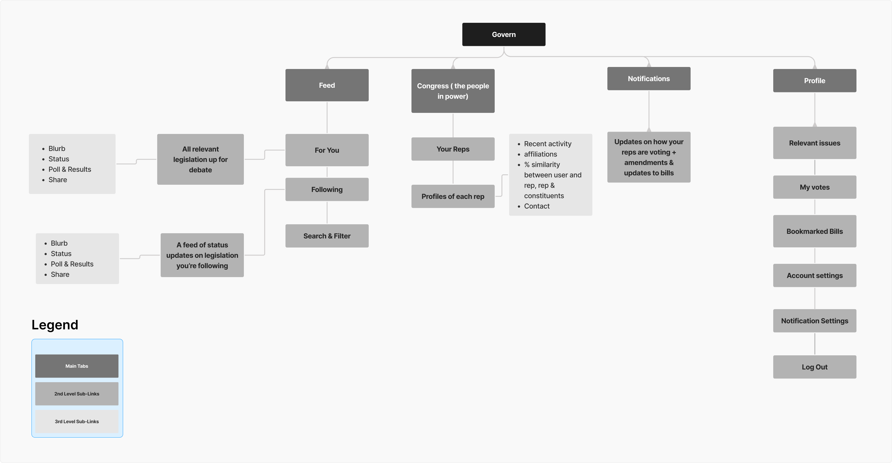
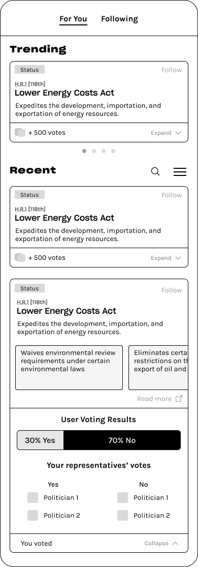
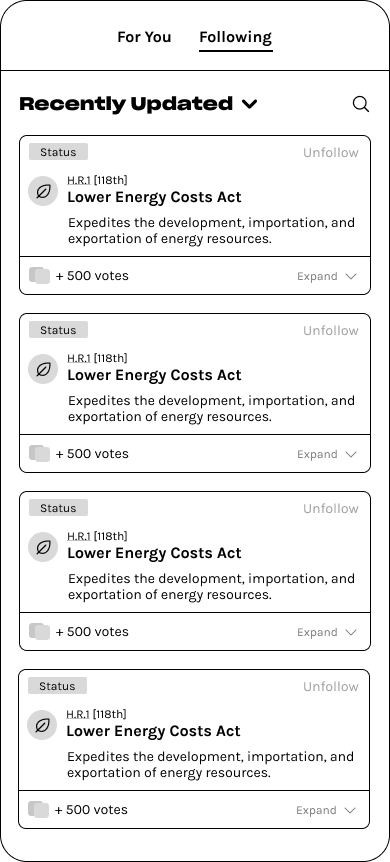
With features prioritized, I started piecing together the information architecture. John had initially envisioned a simple database with three sections: one for recommended bills sorted by topic, one for bills the user is following, and one to keep track of politician voting activity. I decided to cluster the first two under a home feed with "For You" and "Following" tabs, since that is a recognizable design pattern for apps with lots of content to parse through. I created a category specifically to look at members of Congress and what they're up to, like an address book with social profiles.
User Flows
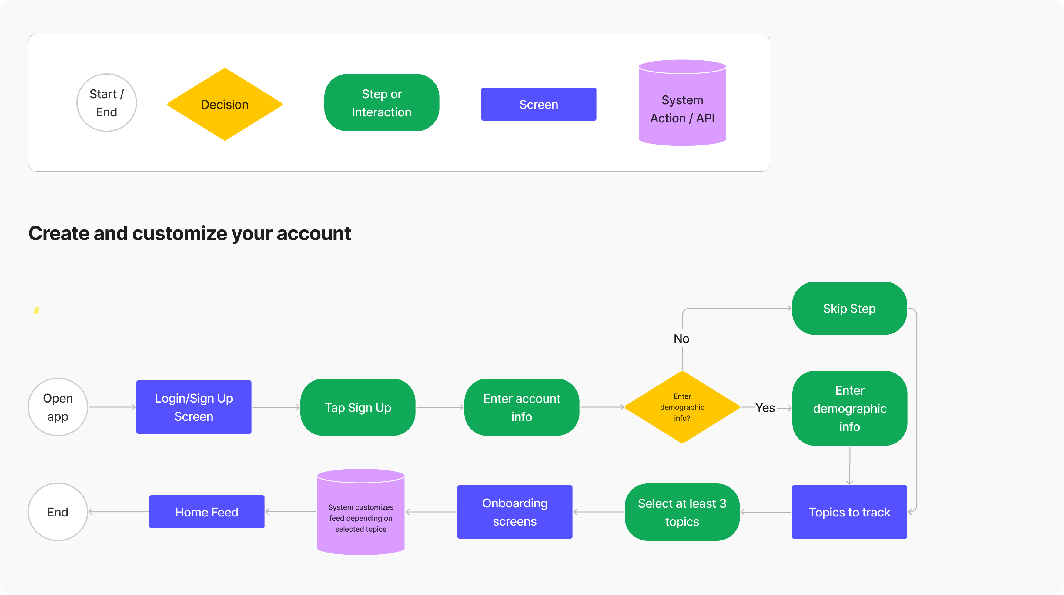
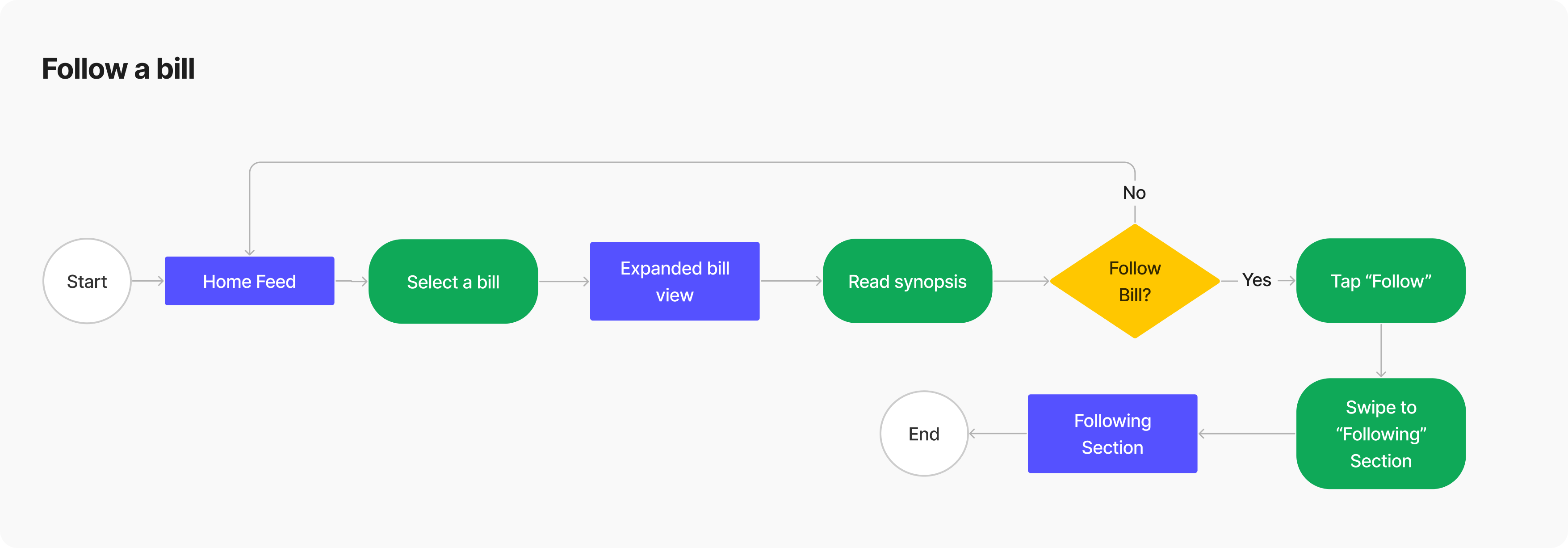
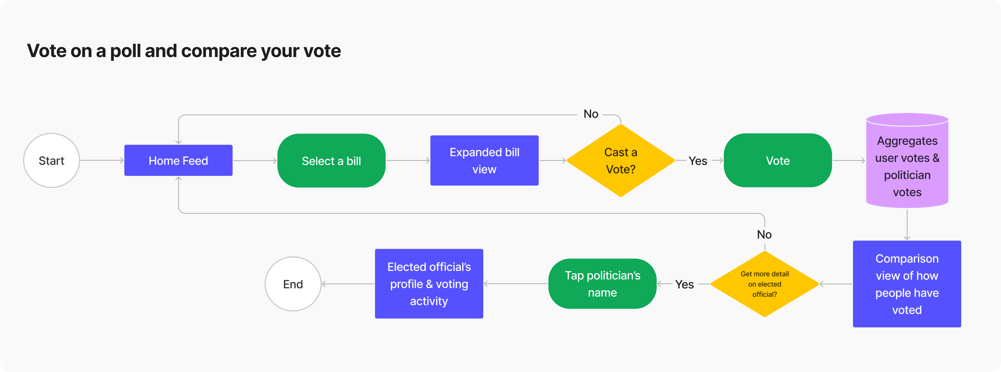
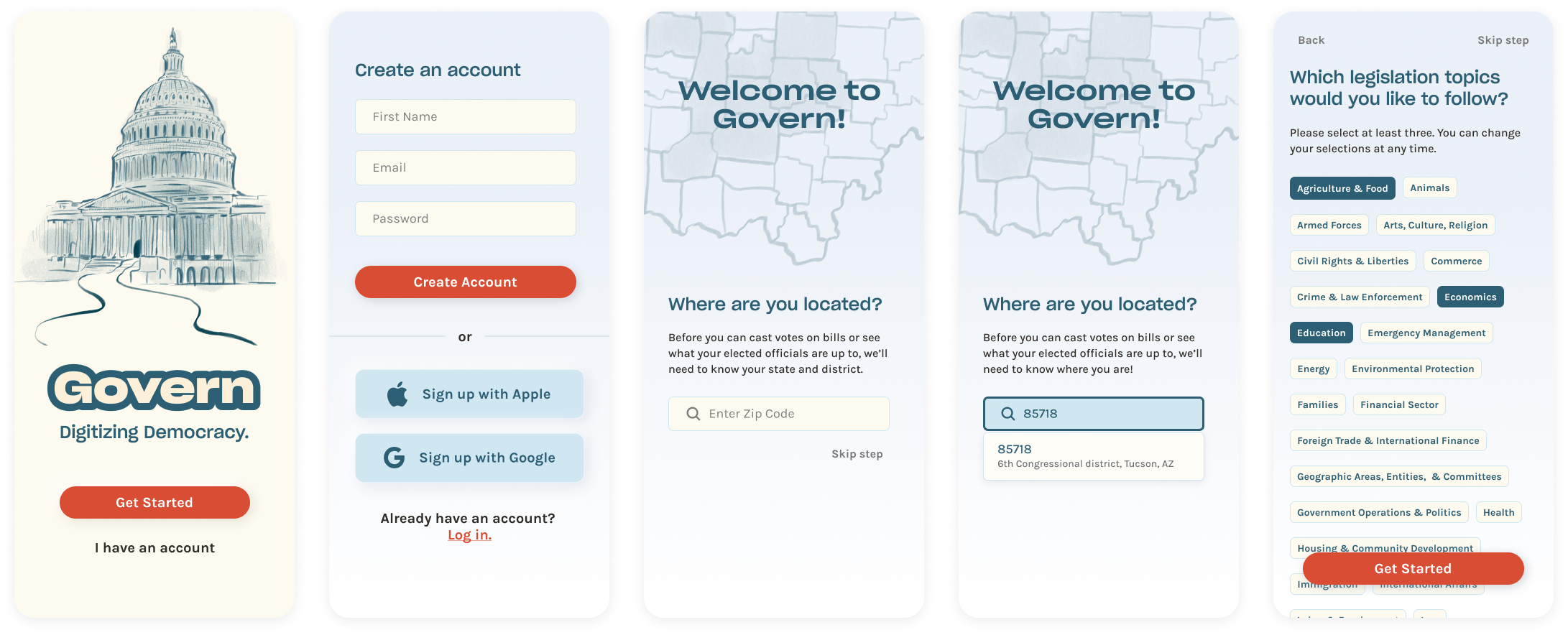
Once I was happy with the content organization, I began thinking about how I wanted the user to interact with the app to accomplish some important goals – create an account, follow a bill, and complete the voting process. I included some decision points where a user may not want to pursue more information, or may want to skip a step.
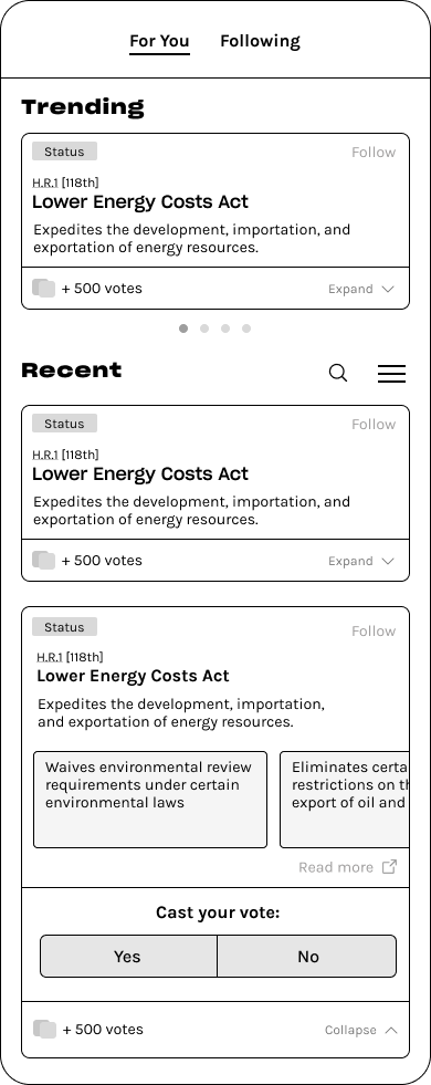
I decided that users must vote in order to see how their districts and representatives voted, as an incentive to vote but also to prevent the bandwagon effect or bias for/against a certain politician.
Low-Fidelity Explorations
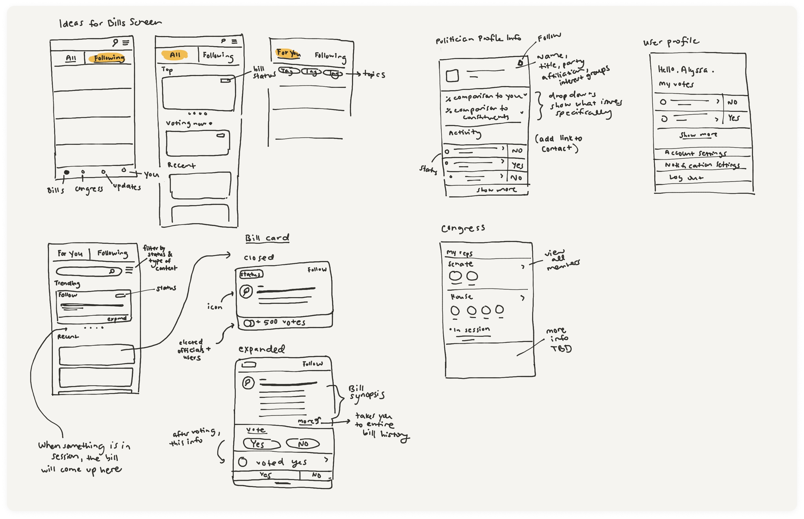
Here are some selected sketches, where I explored how a feed of legislation could look. I sketched how a bill might look as a summarized card, with the option to expand it in order to read more and interact with the bill further.
BRANDING
I designed approachable branding with a retro feel.
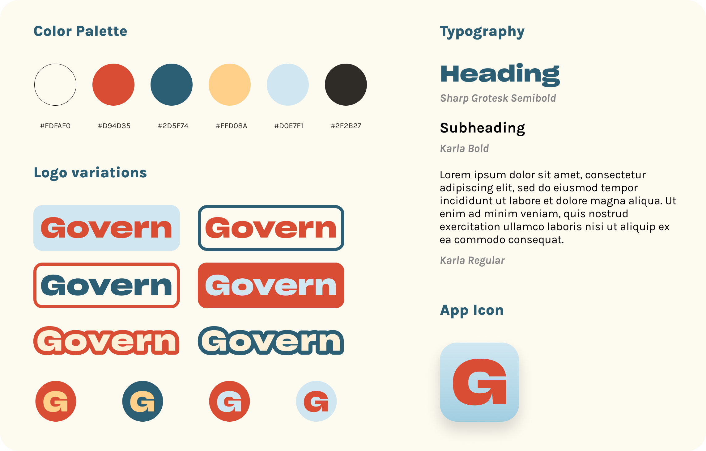
I wanted to avoid the sense of blandness and severity common in many political apps. Instead, I chose colors and fonts that feel playful and bold. Rather than going with primary red, white, and primary blue (as one would expect from an American politics app) I chose a tomato orange-red, teal, and cream to set the app apart and evoke a new way of looking at U.S. politics. The result is a style guide with a clean, warm, retro flair that will appeal to all generations.
HIGH FIDELITY PROTOTYPE
The first round of high-fidelity screens.
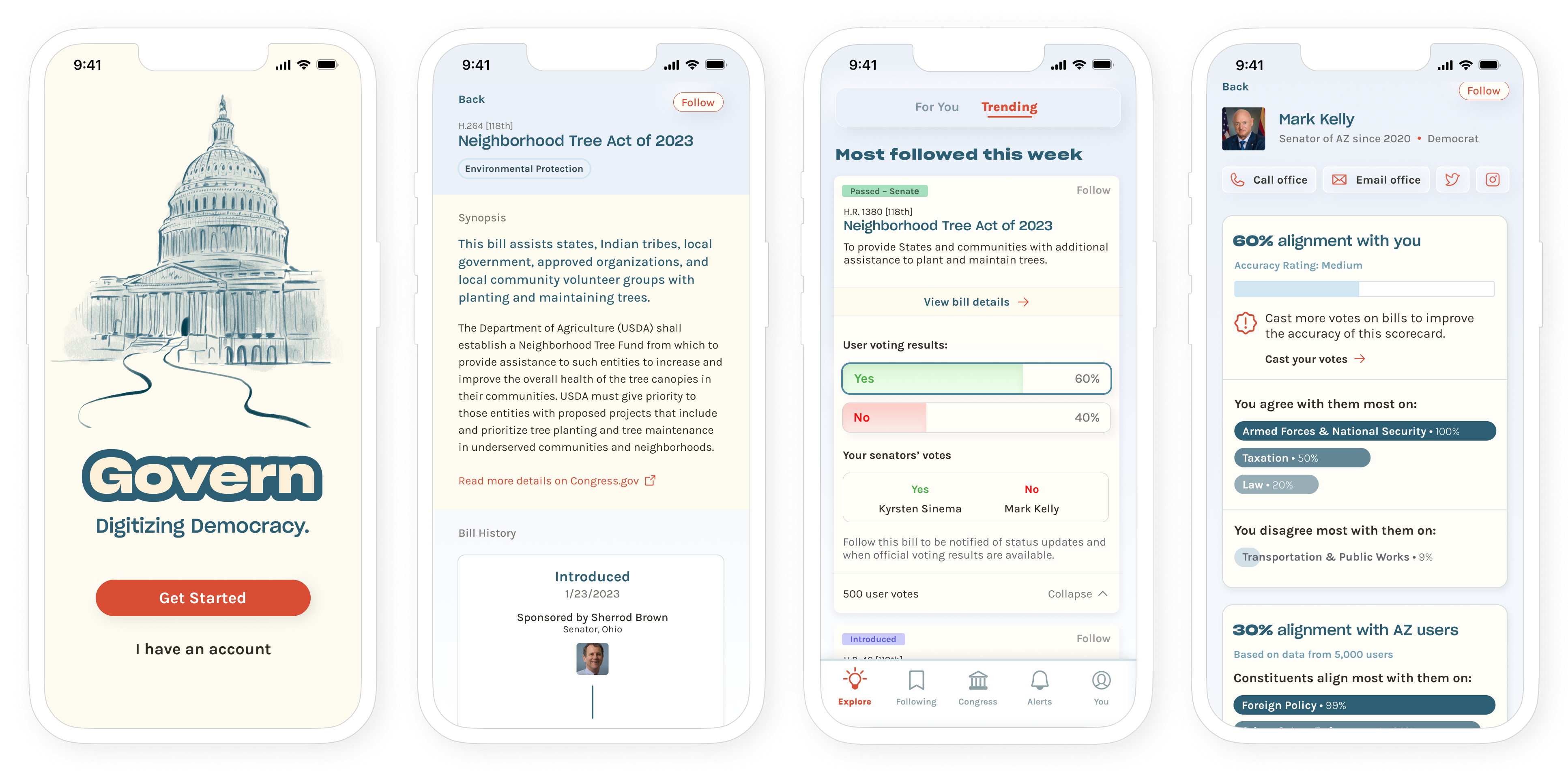
Based on the happy paths in my user flows, I prototyped the key flows that would be most important for an MVP. The following screens went through major changes after usability testing.
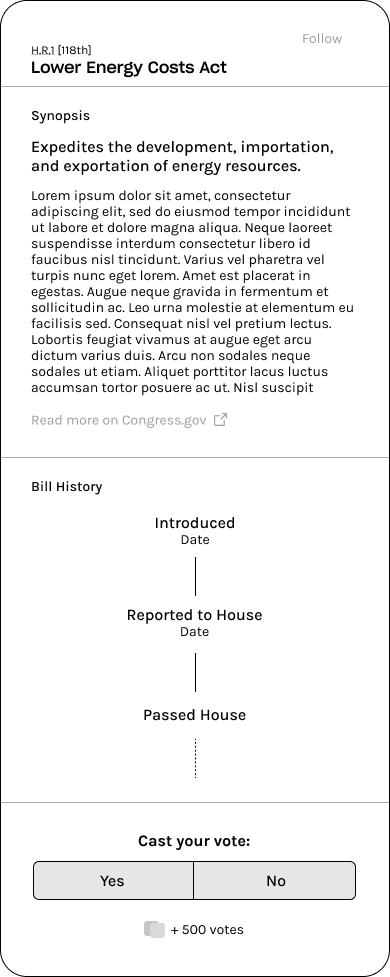
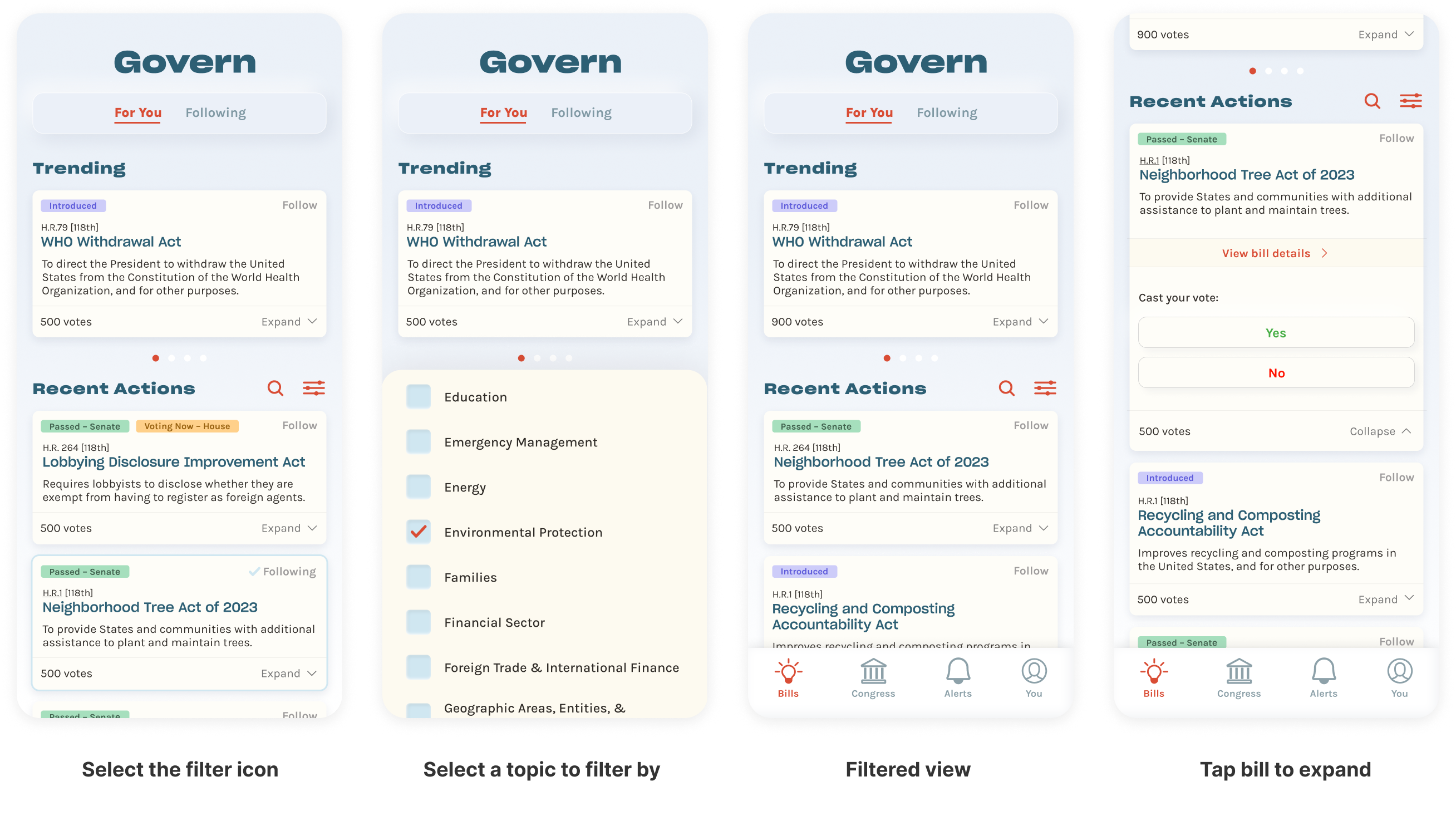
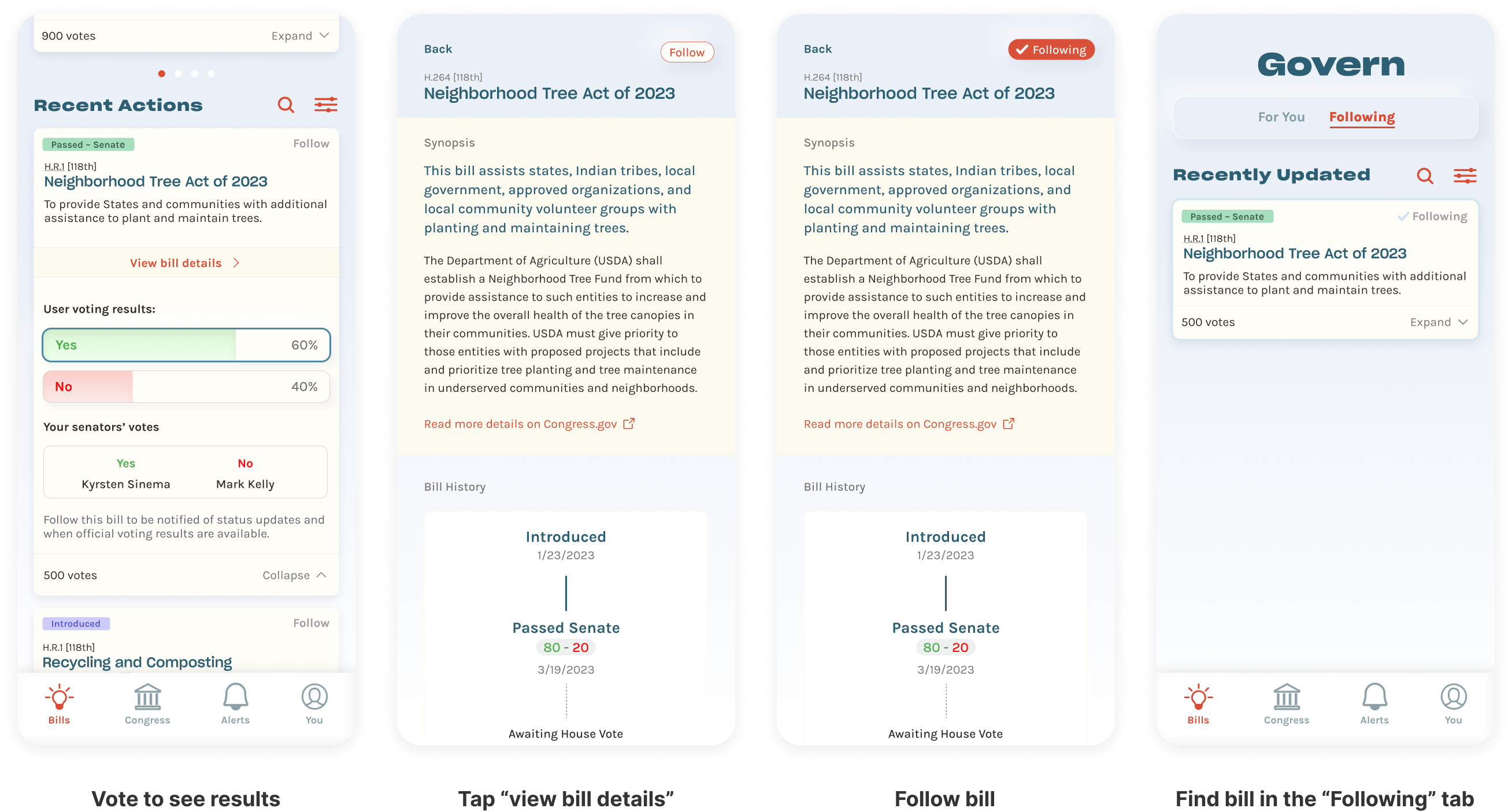
Search for a topic, vote on a bill, and follow it
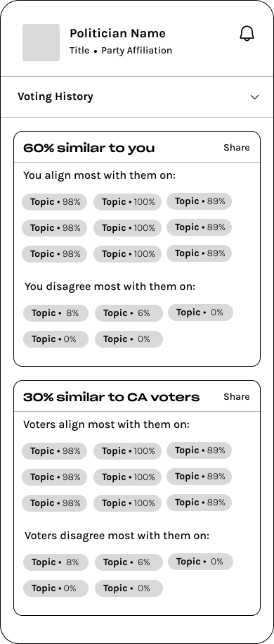
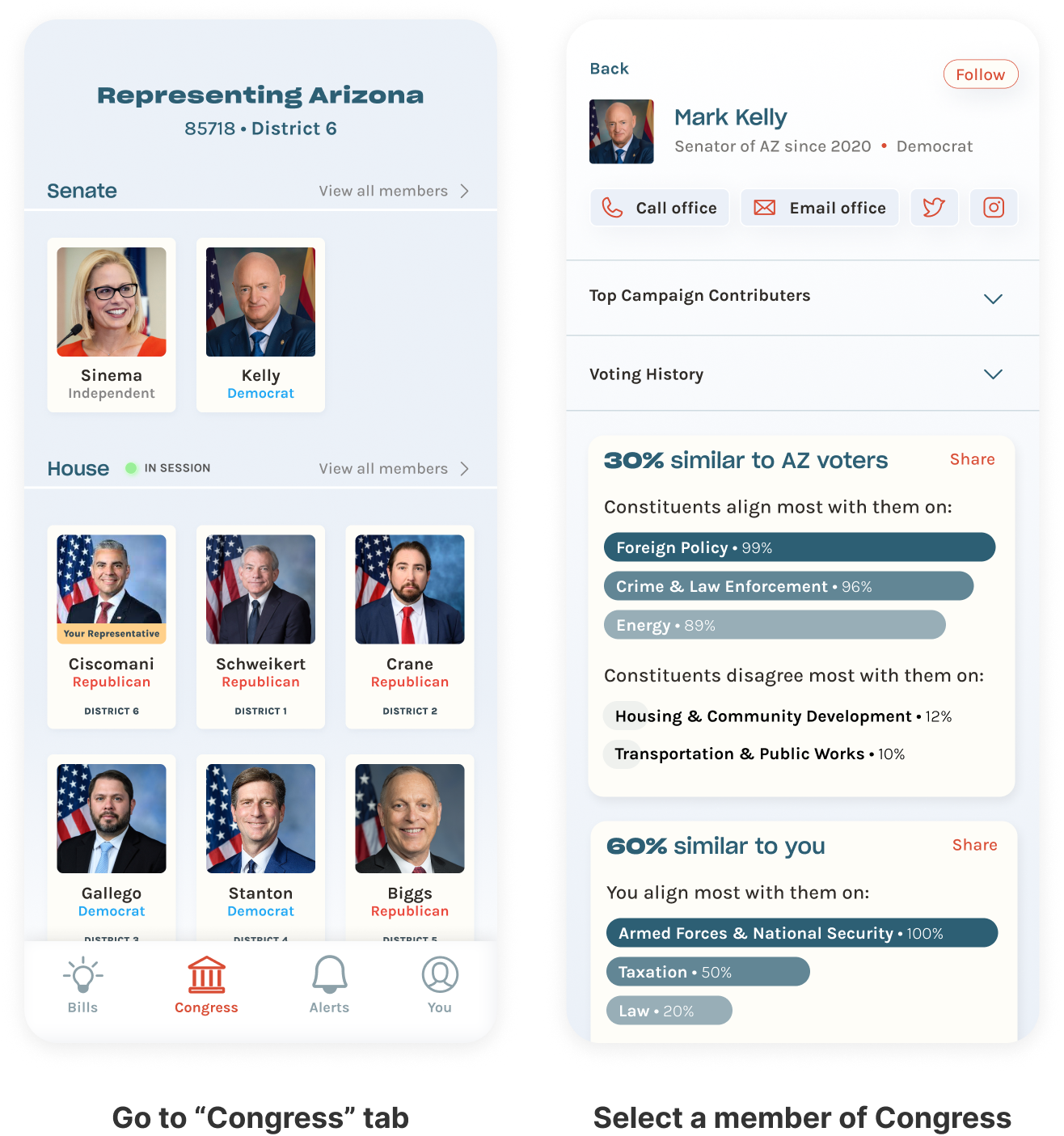
View senator information
USABILITY TEST
I tested five users' ability to complete these task flows in the prototype.
In a mix of in-person and Zoom 1:1 usability tests, I tested the prototype with U.S. citizens of voting age who self-identified as politically active. I measured success by the number of user errors and the reported ease of navigation through the tasks. I also wanted to see how well the app addressed users' pain points, motivations, and goals.
Usability Test Insights & Priority Revisions

"It seems like the home screen would be a lot to sift through and figure out what to highlight. There’s proposed legislation that is never gonna pass!"
– L.M., test user
Overall, participants navigated through the flows with ease – there were no errors or hesitation of any kind across all five tests! However, they all had comments and questions about the content of the screens and the practicality of the features. A round of affinity mapping revealed patterns of user confusion around certain features, especially around the lack of filtering possibilities for so many thousands of bills.
I was a bit stuck on how to reorganize the Discover screen to make way for the new filters, topic recommendations, trending bills, ways for people to vote on bills their representatives have voted for, and followed bills. I began by doing some sketching.
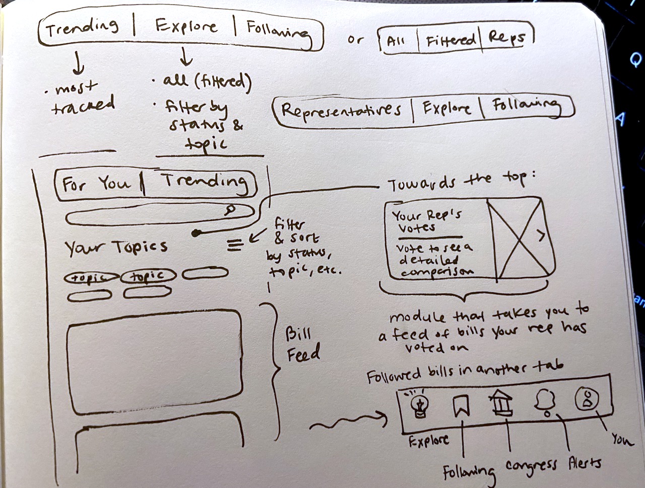
Below is my final solution to that problem, as well as how I addressed the rest of the user feedback.
I made the bills screen more customizable.
With so many bills going through Congress at any given time, users expressed some confusion about the default order of bills. Users had different preferences on how they'd filter this screen, so I added more options for filtering and clarified the language.
I clarified the purpose of voting in the app.
Users did not immediately know that they could vote in the app upon opening it for the first time. It also wasn't clear to them that voting would allow them to unlock more insights in the app. I clarified this in the onboarding flow and added a module where users can go to vote specifically to get data on their opinions vs. those of their politicians.
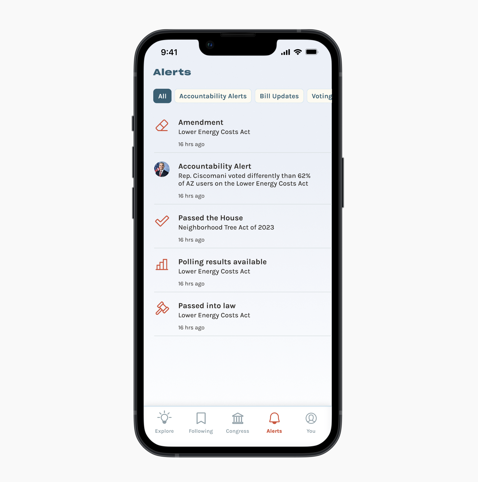
I made it possible to filter through different kinds of alerts.
Users were most excited about the prospect of alerts about their representatives voting in an unexpected way. Since there are many types of alerts, I made them into filters.
What does "Yes" or "No" mean in the context of this bill?
A few users pointed out that bill language can be tricky, and sometimes it's not clear what "Yes" or "No" would do. I designed a way to tell, inspired by voter guides.
NEXT STEPS
Govern is still a work-in-progress, on its way to becoming a reality.
My next step is to conduct another round of usability testing to see if this latest iteration resonates with users. I am also exploring the addition of a feature that allows users to see exactly what text has been amended in a bill, with past language crossed out and new language highlighted.
When the design system is ready, I will pass the design off to a developer for deployment. Working on an app with potential for real social impact has been so rewarding, and I'm excited to continue it as a passion project.
More case studies
toniesUX Design
Too Good to GoProof of Concept
You made it to the bottom! While you're here, let's connect.
LINKEDIN linkedin.com/in/alyssalong13/
Made with lots of love and espresso
ALYSSA LONG | 2024
