Sharing the joy of screen-free play.
Designing the user experience for tonies' referral and rewards program to reward "word-of-mom."
INDUSTRY
Toys / EdTech
THE TEAM
Web Developers
iOs & Android Developers
tonies CRM Team
& myself!
MY ROLE
Wireframing
UX Design
Visual Design
Prototyping
TOOLS
Figma
Asana
DURATION
2 Months (2024)
CONTEXT
The Toniebox is a screen-free entertainment system for kids.
When a Tonie – a small figurine – is placed on top of the Toniebox, stories, songs, and educational content will play. There are over 200 Tonies to collect featuring content from Disney, National Geographic, and more. Through the mytonies app, users can access parental controls and shop for new Tonies.
As a designer at Tonies, I led design for a new and improved Refer a Friend program, partnering with engineers and internal stakeholders to customize a user journey that balanced business and user needs.
THE WHY
User research showed that tonies needed a way to reward "word-of-mom."
"Word-of-mom" is the main way that families learn about the Toniebox – like word of mouth, but between parents determined to find the healthiest ways to entertain their kids without screen time.
During usability tests for a different feature on the website, several power users expressed that they wished tonies had a rewards program. Superfans of the brand were already spreading the word, and it was time we encouraged this behavior!
THE PROBLEM
Existing tonies customers felt frustrated by the lack of rewards for their loyalty and brand advocacy, leading to missed opportunities for deeper engagement.
THE SOLUTION
Create a seamless, on-brand referral experience, featuring in-app integration, landing page, email flow, and a rewards dashboard.
KEY RESULTS
Aug 1 – Oct 23, 2024
28%
Referral Share Rate
% of customers exposed to the program who share their link
35%
Friend signup rate
% of referral recipients who sign up to receive the discount
52%
Sign-up to conversion rate
% of referral recipients who converted after signing up
135%
Referral engagement rate
(For every share, the program generated 1.35 clicks)
USER FLOW
We mapped out the end-to-end user flow to define the touchpoints to create.
Working with our referral marketing platform, Extole, we planned the ideal user flow, starting with sending a friend a $15 off code and ending with the friend accepting and using the code.
In this context, the "advocate" is the person sharing their referral link, and the "friend" is the recipient of the referral link.
Friends must spend $99+ to receive $15 off. When a successful referral happens, the advocate gets $15 off their order of $50 or more.
MVP
Working against a tight deadline, we launched the program with a landing page and email flow.
Faced with pressure to get the referral program up and running well before the holiday gifting season, I immediately designed the program's key components in Figma. I worked closely with the engineering team to determine technical constraints.
The landing page features a series of simple modules, powered by Extole.
Advocate Flow
Friend Flow
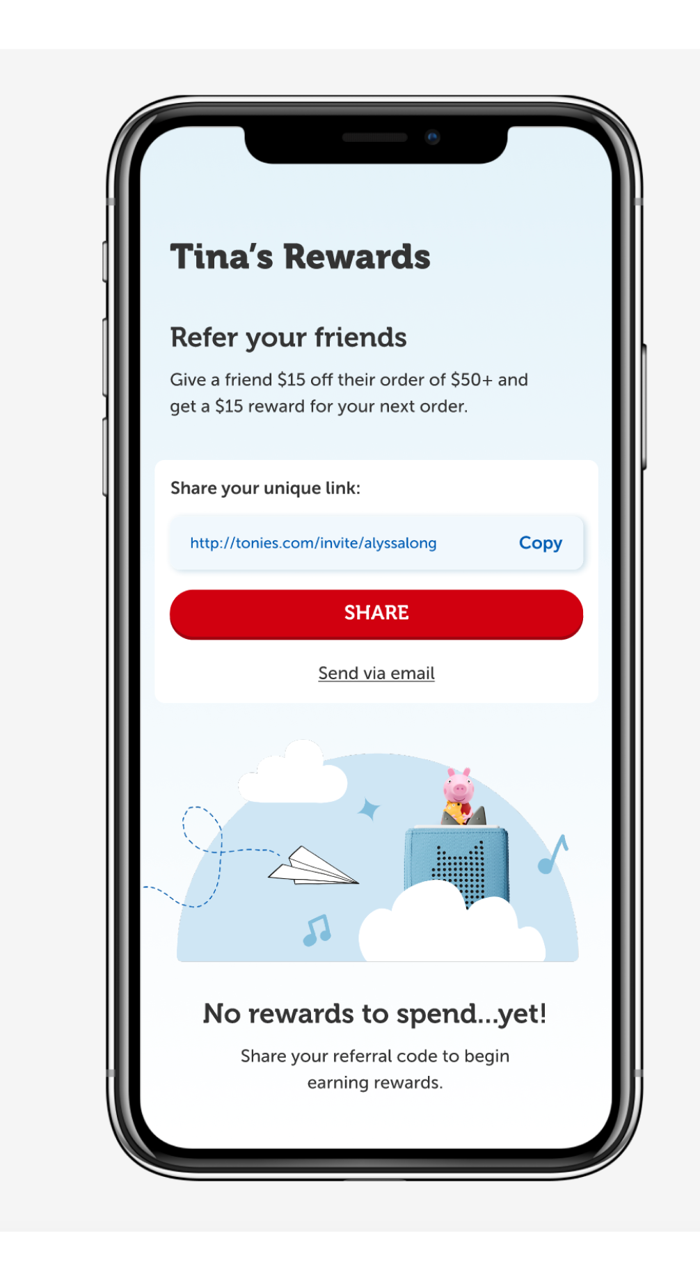
REFERRAL DASHBOARD
One place to share your code, redeem rewards, and track your progress.
With the essential pieces of the new referral program launched and running smoothly, I set to work designing a dashboard for referrals: a central hub where users could track their progress, view earned rewards, and easily share a single referral code. While the landing page effectively facilitated code sharing and emails notified users about rewards, the experience lacked elements of gamification and progress indicators.
Extole provided us with the out-of-the-box solution below.
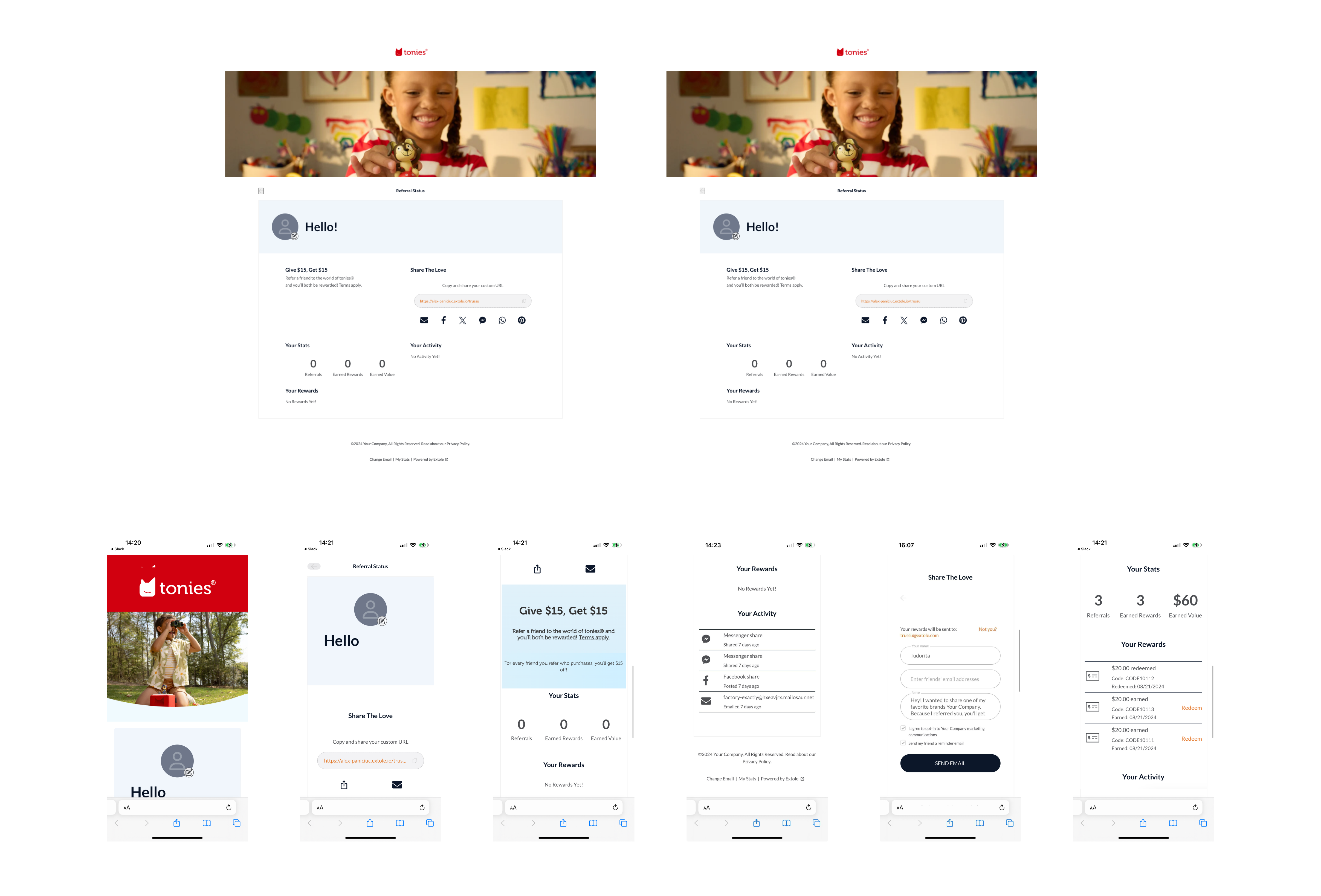
Eager to make this dashboard as accessible, clean, and on-brand as possible, I designed the experience below. 85% of our users interact with the website on mobile, so I began with mobile first:
Empty State
Share Experience
Desktop Experience:

DESIGN ITERATIONS
Based on user behavior, I simplified the share options on the site modals to eliminate unnecessary choice.
Before:
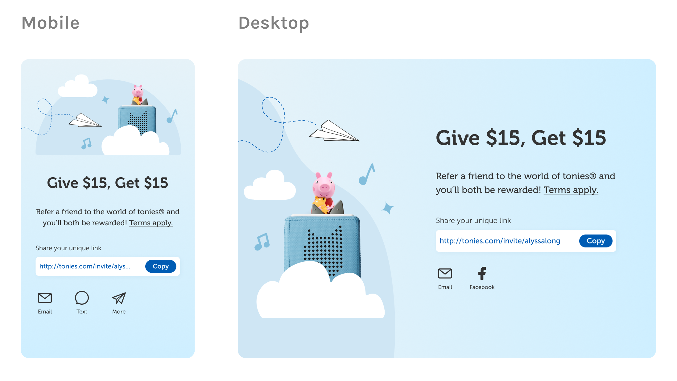
In the span of two weeks since the program's launch, out of thousands of shares, only one person had shared their code via the Facebook share icon.
On mobile, most users opted to use native share features or copy and paste their code. On desktop, most users chose to email their code or copy and paste.
After:

For the desktop modules and dashboard, I removed all social share options, replacing them with one CTA to share the code via email.
For the mobile modules and dashboard, I replaced the social share options with a Share CTA that opens native share options, with a smaller text link beneath it that opens email share options.
RESULTS
Mid-October saw a 366% spike in conversions from the referral program due to a sitewide sale.
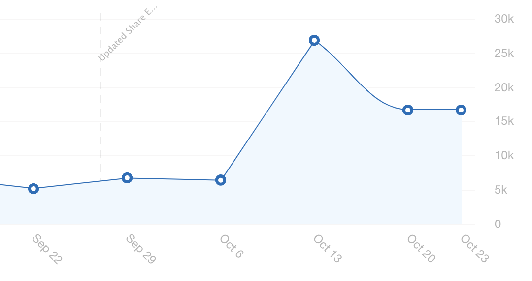
With a 20% off sitewide sale beginning October 13, customers sought to maximize their discount and push friends to take advantage of the deal by sharing their referral links.
Referred friends may have waited to use their $15 off discount until the sale began.
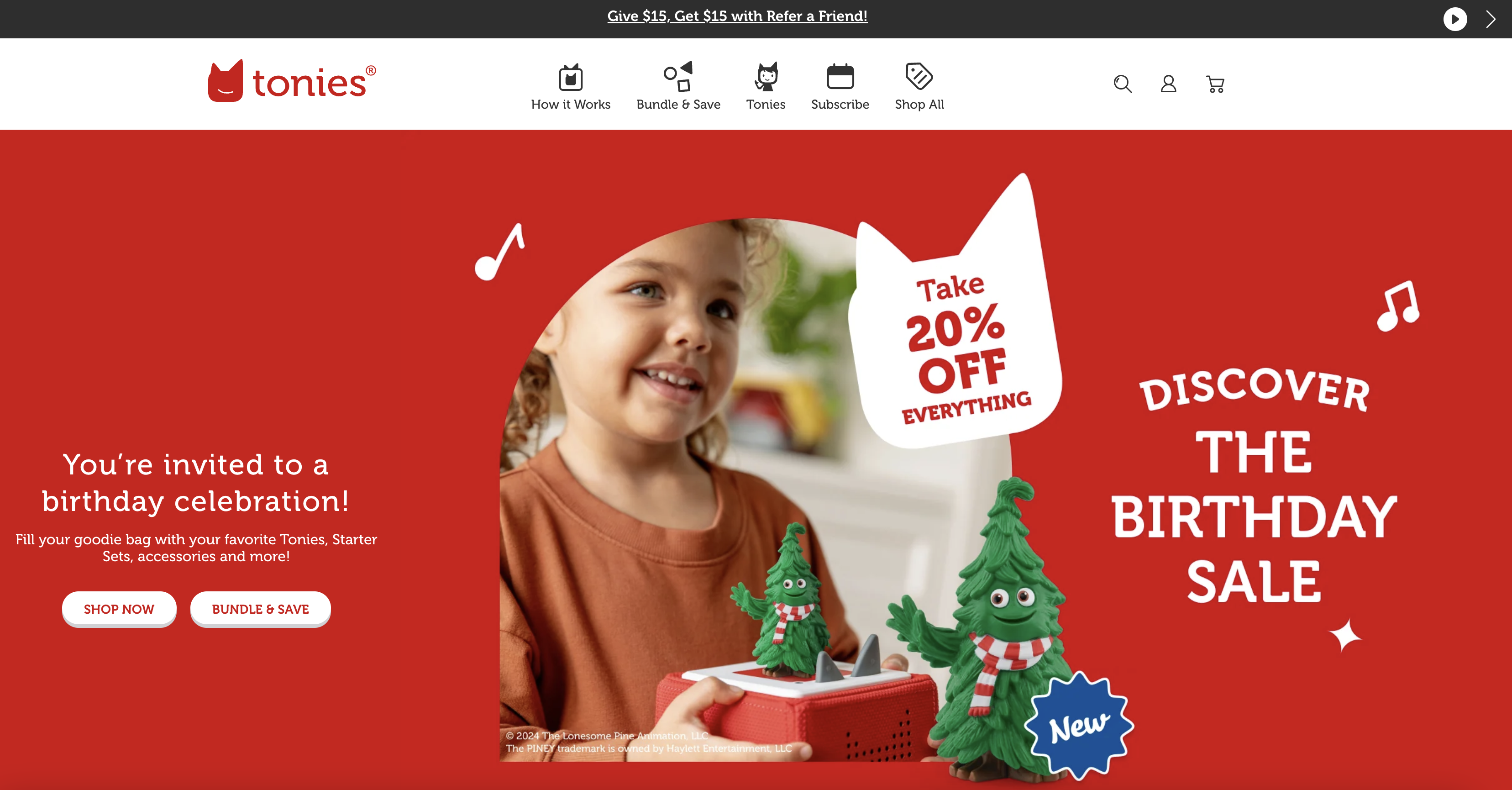
We added a Refer a Friend banner along the top of the website, which was likely a huge factor in the spike.
More case studies

GovernClient Project
Too Good to GoProof of Concept
You made it to the bottom! While you're here, let's connect.
LINKEDIN linkedin.com/in/alyssalong13/
Made with lots of love and espresso
ALYSSA LONG | 2024